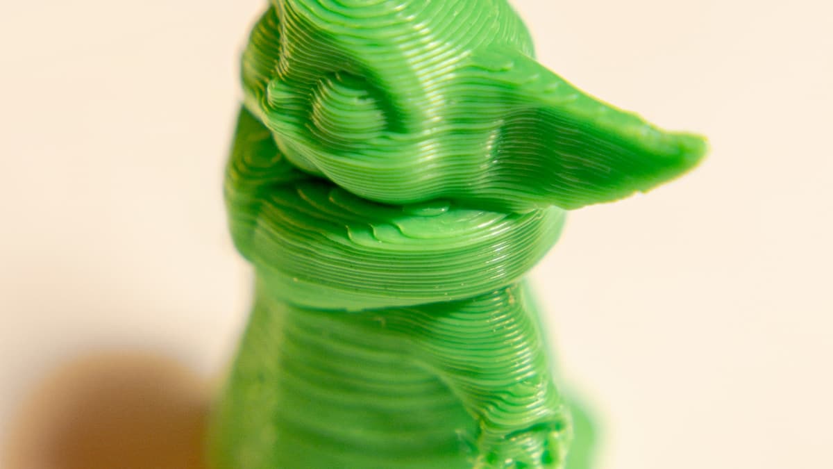
You drew a part number on the underside of a bracket, or a logo on the lid of an enclosure, and what came off the plate is a smudge. 3D printed text fails more predictably than almost anything else on a printer, and the reason it frustrates people for so long is that it looks like a quality problem when it is actually an arithmetic one. A nozzle cannot draw a line narrower than its own orifice. If a letter stroke is thinner than one extrusion, no amount of slowing down, cooling harder or calibrating will produce it.
This post contains affiliate links. If you purchase through these links, 3D Prototyping Hub may earn a small commission at no extra cost to you.
This post also contains Amazon affiliate links. As an Amazon Associate we earn from qualifying purchases.
Start With The Number, Not The Settings
A 0.4mm nozzle lays a line roughly 0.4 to 0.45mm wide. That single figure sets the floor for every feature on the part:
| Feature |
Minimum that works with a 0.4mm nozzle |
What happens below it |
| Raised letter stroke |
0.8mm (two extrusions) |
Fattened to 0.4mm, letters merge into each other |
| Raised letter height |
0.4mm (two layers at 0.2mm) |
Visible as a texture, not as text |
| Engraved channel width |
1.0mm |
Walls either side meet and fill it solid |
| Engraved channel depth |
0.4–0.6mm |
Closes up under the top solid layers |
| Cap height, legible |
5–6mm |
Strokes fall below the floor above |
Measure the actual stroke width in your CAD or slicer preview before you print anything. Most mushy text is explained entirely by that table, and the most common cause of all is scaling: a model that carries perfect lettering at 100% has unprintable lettering at 60%, because the text scaled with everything else.
Font choice is part of the same arithmetic. Bold, even-weight sans-serif faces print because every stroke is the same width and that width can be made wide enough. Anything with hairline serifs, thin-thick contrast or a script connection will lose the thin half of each letter while the thick half prints fine — which reads as a printer fault and is a typography decision.
Raised And Recessed Text Fail In Opposite Directions
This is worth separating because the fixes point in different directions.
Raised text is forgiving. Modern slicers using a variable-width perimeter generator — Arachne in PrusaSlicer, Cura and Orca — will widen a too-thin stroke into something printable rather than dropping it. The letters come out fatter than drawn and slightly blobby, but they are there. That is the failure you want.
Recessed text is unforgiving. A narrow channel is a gap between two walls, and when the gap falls below one extrusion the slicer closes it. The surrounding surface prints perfectly and the marking simply is not there. Worse, it fails silently — the preview often shows the channel because the preview is drawing geometry, not extrusions.
So the default on a desktop machine is raised lettering on an upward-facing surface, 0.8mm or wider in stroke, 0.4mm or more proud. If the design requires engraving — a mould tool, a part that gets handled, a surface that has to stay flush — widen the channels past 1mm and plan to fill them with paint, because a correctly printed 0.5mm-deep channel in grey PLA is still almost invisible.
Which Face The Text Sits On Decides Which Resolution Applies
An FDM printer has two completely different resolutions and the marking inherits whichever one its surface normal points at.
- Top face. Limited by extrusion width, around 0.4mm. The letters are drawn as flat raster paths and look the way the table above predicts.
- Vertical face. Limited by layer height in Z. Letters are stacked slices, so horizontal edges are quantised and curves staircase. The top of every letter is also a small unsupported overhang that sags. Dropping to a 0.1mm layer height transforms side text and barely touches top text.
- Bottom face. The worst option. First-layer squish spreads the extrusions outward, so raised text thickens and loses its gaps while engraved text fills with the same spread that causes elephant's foot. If marking has to be on the bottom, make it bolder than anywhere else and check first-layer compensation before blaming the design.
Reorienting the part so the marking faces up is free and it is almost always the highest-yield change available. Where the geometry will not allow it, the broader orientation trade-offs are set out in our design for 3D printing guidelines.
The Slicer Settings That Are Actually Worth Changing
Only a few of these matter, and they matter in this order:
Turn on the variable-width perimeter generator if your slicer has it and you have inherited an old profile. This is the single setting that decides whether a 0.6mm stroke prints as a 0.6mm stroke or gets dropped. Check the minimum feature size value while you are in there.
Slow the outer wall and the small perimeters to 20–30mm/s. Letter outlines are short closed loops full of direction changes, and at speed the extruder cannot keep up with the acceleration profile. The result is thin starts, blobbed ends and rounded corners — the same mechanism behind ringing and ghosting, concentrated on the smallest feature on the part.
Calibrate pressure advance or linear advance. Uncalibrated, every tiny loop starts under-extruded and ends with a bulge. On a 40mm wall you never notice. On a 2mm letter, that is the whole letter.
Move the Z seam away from the marked face. A seam blob is roughly the size of a letter stroke, and it lands in the same place on every layer.
Turn ironing off. Ironing drags a hot nozzle across the top surface to smooth it, which is exactly what you do not want applied to the top of raised letters.
Dry the filament. Moisture boils in the melt and makes extrusion irregular at a scale invisible on a large surface and fatal on a 0.8mm stroke. If the printer hisses or the surface has pinholes, fix that before changing anything else — the mechanism is the same one behind filament that snaps on the spool.
Change one of these at a time and print a 25mm test tile with your actual logo on it rather than the whole part. The tile takes six minutes and tells you more than three failed enclosures.
When The Fix Is Hardware
If the marking has to be smaller than the arithmetic allows, the nozzle is the limit and it is the thing to change. A 0.2mm nozzle halves the narrowest line the machine can produce, which brings 0.4mm strokes and 3mm cap heights into range. Be clear about what it costs: print time for the whole part roughly doubles, filled filaments with carbon fibre, glitter or wood particles are out, and the orifice jams on debris that a 0.4mm nozzle would pass. A cleaning kit with fine needles and a cold-pull habit is what makes that practical; the wider trade-off between nozzle sizes is covered in our guide to 3D printer nozzles.
Two cheaper changes are worth trying first, because a surprising amount of "mushy" text is printed correctly and simply cannot be read. Matte PLA diffuses the specular highlights that glossy filament throws across shallow edges, and it costs nothing dimensionally. And put calipers on the stroke that came off the plate before you touch a setting — if it measures 0.45mm when you drew 0.6mm, the problem is in the model, not the machine. That measure-first discipline is the same one behind prints that come out the wrong size.
When FDM Cannot Do It At All
Some marking is below any nozzle. Instrument panels, jewellery, scale-model insignia, dental and medical identifiers — these live at stroke widths of a few tenths of a millimetre, and a filament printer has no path to them.
An MSLA resin printer images an entire layer through an LCD, so its in-plane resolution is the screen's pixel pitch, typically 0.017 to 0.05mm. That is roughly an order of magnitude finer than an extrusion, which is why a resin miniature carries legible heraldry at 28mm scale. Machines from ELEGOO's resin printer range and Anycubic's US store sit in the price band where this stops being an industrial decision; what to read on the spec sheet is the stated XY pixel size, not the layer height, because the pixel is what sets the narrowest line on a flat face.
Prove the detail in an opaque material. Grey model resin shows edges that clear and coloured resins scatter into invisibility, and if you are printing enough of it for bulk buying to make sense, Chitu Systems' Conjure standard resin in 10kg is sold in that format. The costs on this side are different rather than absent: resin parts are more brittle than PLA, they yellow and embrittle in sunlight, and over-enthusiastic scrubbing during washing rounds over the detail you bought the printer for. The full comparison is in SLA vs FDM printing explained.
Or Stop Printing The Marking
Once a part is going to exist in quantity, lettering stops being a slicer problem and becomes a process decision. Production housings are laser-marked, pad-printed or given an engraved metal insert, none of which depend on your nozzle condition on the day. A printed production run is better served by an SLA or MJF part from a bureau, which resolves fine text routinely and — more usefully — resolves it identically across the batch.
That is the point at which to hand it over. The providers in our directory quote marked parts from an STL plus a drawing of the marking, and will tell you before you commit whether the text you have drawn is reproducible in the process you picked.
For everything else, work it in this order. Measure the stroke you actually drew. Move the marking to a face that prints upward. Switch to a bold even-weight font and widen the strokes past 0.8mm. Turn on the variable-width perimeters, slow the outer wall, and dry the filament. Then, and only then, change the nozzle — because a 0.2mm nozzle fitted to a part whose text was never printable at any size just takes twice as long to produce the same smudge.
Hero photograph by Girl with red hat via Unsplash.